Sponsored Content

Back to Life: Discover Dulux’s Colour of the Year 2021
Brave Ground is a deep-toned neutral that's ideal for adding a calm, luxurious feel on its own or with other hues
Sponsored Content
After a year we probably want to forget, Dulux presents a Colour of the Year for 2021 that is calming and restorative. Brave Ground is an organic clay hue that creates a comforting sanctuary where you can revive and reboot to face the year ahead.
For Dulux’s creative director, Marianne Shillingford this visually peaceful colour combines the building blocks of nature with the things that make us human. “We draw comfort and energy from familiar known things, and there is nothing more familiar or known than the natural clay from which we have built our houses, crafted vessels and created art for millennia,” she says. “It is the raw ingredient that provides the strong foundations, walls and roofs of our homes and it is in our homes where we find the shelter and sustenance, we need for facing the challenges the world throws at us.”
Here we look at why this earthy colour captures the mood of the moment and how we can make it work in our homes.
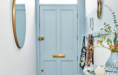
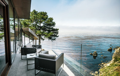
Walls painted in Brave Ground, Dulux
Here we look at why this earthy colour captures the mood of the moment and how we can make it work in our homes.
Walls painted in Brave Ground, Dulux
Why it works…
“The thing I like best about this colour is that although it looks beautiful on its own, it plays a supporting role for all other colours and lets them shine. It’s like the ‘Mother Earth’ of hues.” says Marianne. Brave Ground has an easy elegance, yet feels familiar, soothing and ‘grounded’. You could paint your whole room with it for a cocooning look, or team it with other shades as a balancing neutral.
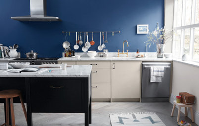
Shutters painted in Brave Ground; walls painted in Midnight Garden (upper) and Mysterious Teal (lower), all Dulux.
“The thing I like best about this colour is that although it looks beautiful on its own, it plays a supporting role for all other colours and lets them shine. It’s like the ‘Mother Earth’ of hues.” says Marianne. Brave Ground has an easy elegance, yet feels familiar, soothing and ‘grounded’. You could paint your whole room with it for a cocooning look, or team it with other shades as a balancing neutral.
Shutters painted in Brave Ground; walls painted in Midnight Garden (upper) and Mysterious Teal (lower), all Dulux.
What to pair it with
The Dulux team have put together four palettes of ten trend colours, which all contain Brave Ground. In each one, this beautiful earth tone plays a different role. Let’s take a look…
The Dulux team have put together four palettes of ten trend colours, which all contain Brave Ground. In each one, this beautiful earth tone plays a different role. Let’s take a look…
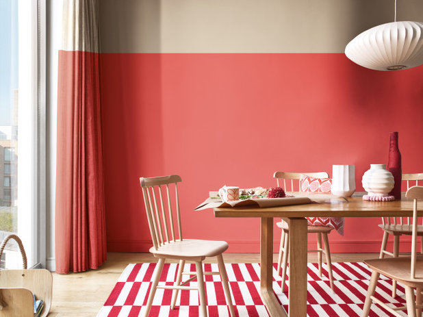
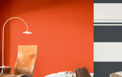
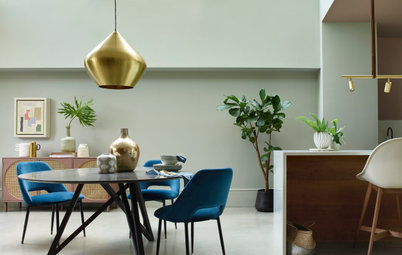
Punchy pinks
The Expressive palette is made up of energising reds and pinks. When teamed with blush and rose tones, “Brave Ground becomes the sophisticated colour that anchors the look and feel of a space,” explains Marianne.
Here, for example the deep red tones in the rug and vibrant coral walls are lifted by a band of Brave Ground along the highest part of the room. The neutral hue brings a gentler element to the dynamic space.
Bonus Tip: Using a paler tone at the top of the room is a clever design trick that helps to open out the space and make it feel larger.
Walls painted in Brave Ground (upper) and Lost Coral (lower), both Dulux.
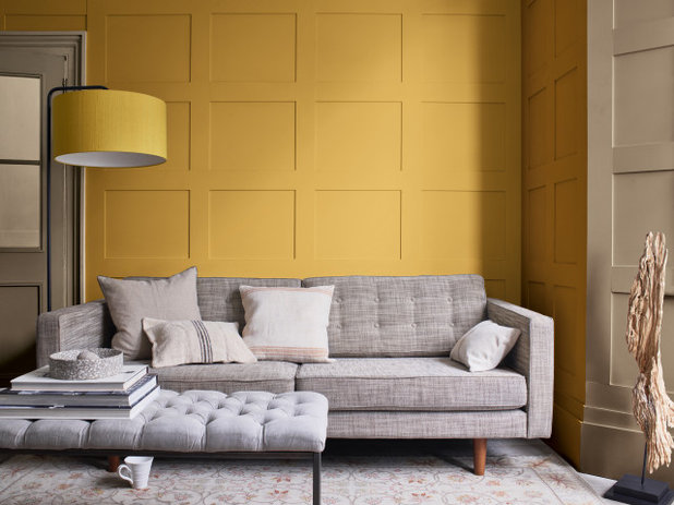
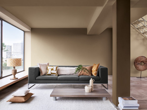
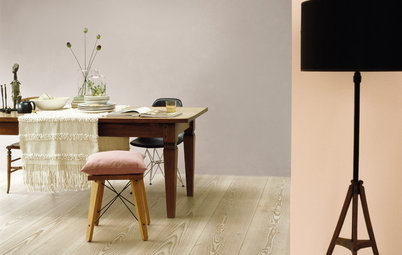
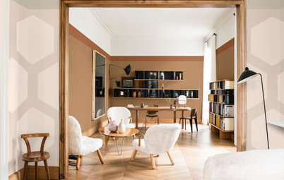
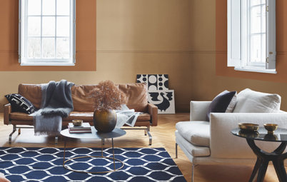
Elemental ochres
For a luxurious look, team Brave Ground with shades of bronze, ochre and yellow. This Timeless palette evokes a warming, positive mood by combining elemental ochre hues from the past with cleaner shades from the present. They offer the perfect palette to unite elements in your home that are in different styles and from different eras.
The Timeless scheme works beautifully in this living room, with its traditional panelled mustard and neutral walls, which surround a crisp, grey contemporary sofa. The bold yellow contrasts with the cool silver tones in the upholstery, while the clay shade provides a harmonious connection between the two.
Bonus Tip: Don’t forget woodwork when it comes to painting your room, and consider continuing a wall colour along skirtings, architraves and doors.
Walls painted in Cherished Gold and Brave Ground, both Dulux.
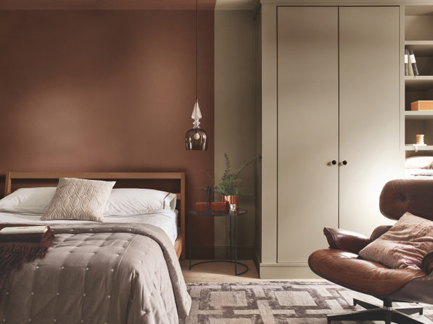
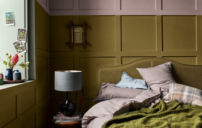
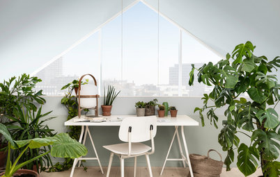
Earthy neutrals
Fancy something more organic? Embrace Brave Ground’s natural feel by combining it with the earthy tones of the Trust palette. Trust colours are the most popular earthy neutrals in every nation on the planet. We simply trust them to work in our homes where we can use them in layers to create interiors with effortless elegance.
In this bedroom, the bed space is enveloped by a vertical band of Blanket Box which gives it a snug, cocooning feel. The room then opens up to become a soothing dressing space in the soft warm neutral Brave Ground.
Bonus Tip: Paint is a great way to zone a room without the use of partitions or screens. Here. a simple vertical line signifies where the sleep area ends and the practical dressing zone begins.
Back wall painted in Blanket Box; cupboards in Brave Ground, both Dulux.
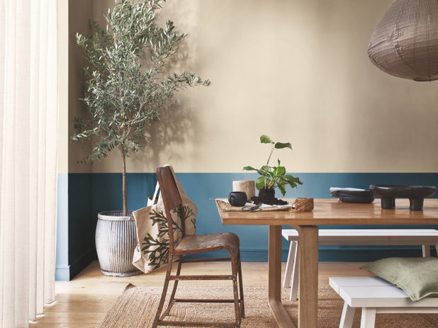
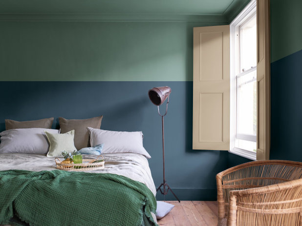
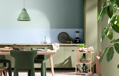
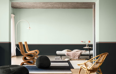
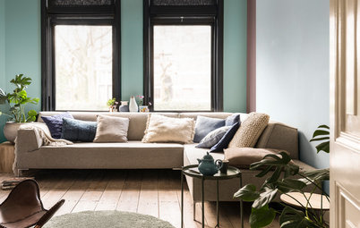
Planet blues
There’s nothing more naturally beautiful than the colours of the planet we live on. In this palette of blues and soft greens, Brave Ground represents the earth beneath our feet and provides a solid foundation from which to build a look that is calming, restorative and bursting with life.
The lower wall section here is painted in Night Seas and teamed with Brave Ground above. The clay hue, wooden surfaces and green foliage work wonderfully with the vivid blue to give the space a tranquil, balanced indoor-outdoor feel.
The blue also adds a bright layer to the organic earthy tones and natural materials in the rest of the room, while Brave Ground brings out the vibrancy of the bold shade below.
Bonus Tip: If you’d like to experiment with Brave Ground on your walls, try using the Dulux Visualiser App or order a colour tester to see how it works with the 2021 trend palettes and all the other colours you love.
Walls painted in Brave Ground (upper) and Night Seas (lower), both Dulux.
Visit the Dulux website for more information on Dulux Colour of the Year.
Looking for more colour tips and tricks? Visit our Colour Inspiration Centre!
Your turn:
What do you think of the Colour of the Year for 2021?
Dulux is the UK’s leading paint brand, with a wealth of expert knowledge, products and services designed to help... Read More


Dulux is the UK’s leading paint brand, with a wealth of expert knowledge, products and services designed to help... Read More
More Stories from This Brand
Everything You Need to Know About Painting With Grey
By Dulux
The greys of the moment are warm, earthy and oh-so-simple to use
Full Story
4 Decorating Challenges And How to Solve Them
By Dulux
Updating your space can be easier than you think, as long as you can overcome these common decorating barriers.
Full Story
Bring in Nature With Dulux’s Colour of the Year 2023
By Dulux
Discover how Dulux’s glowing natural colour, Wild Wonder™, can fill your home with positivity
Full Story
Why Should You Paint Your Woodwork?
By Dulux
Introducing the coolest and easiest way of updating unsung design details such as skirtings, mouldings and door frames
Full Story
Refresh and Revive With Dulux’s Colour of the Year 2022
By Dulux
Find out how Dulux's uplifting colour of the year, Bright Skies™ can breathe new life into your home
Full Story
Colour of the Year 2019: Get the Buzz on Spiced Honey
By Dulux
Dulux's Colour of the Year 2019 is a warm amber tone that promises to energise your home. Find out more...
Full Story
16 Genius Updates for Busy Family Homes
By Dulux
Stick to these top decorating tips and your home will have that newly-painted look for longer
Full Story
5 Paint-Tastic Ways to Transform a Room
By Dulux
Whether it's a new paint colour, a fun effect, or painting a quirky spot, a world of transformative tricks await..
Full Story
How to Choose the Perfect Paint Colour for a Cosy Bedroom
By Dulux
Discover the colours and combinations that will generate calm and weave a cosy spell in your sleep space
Full Story
A New Dawn: Meet Dulux's Colour of the Year 2020
By Dulux
And breeaaathe – this hopeful shade is all about calm, stability and rediscovering ourselves in the decade ahead
Full Story
How to Carve Out Spaces to Work and Rest in a Busy Home
By Dulux
Curb the work-from-home chaos with these nifty home upgrades that use paint to create defined zones
Full Story
How to Create a Timeless Look You Won’t Want to Change
By Dulux
Want to create spaces that never date? The key is to pick classic colours you'll love forever in a modern durable finish
Full Story
5 Expert Tips for Testing Paint Colours
By Dulux
Discover why sampling paints has never been easier
Full Story
How to Bring the Outside In
By Dulux
Nurture your wellbeing by bringing nature into your home with these clever decorating ideas
Full Story
5 Inspiring & Oh-So-Soothing Bedroom Colour Combos
By Dulux
Breathe new energy into your sleep space with a transformative colour scheme
Full Story
What's Your Colour Personality?
By Dulux
Are you team neutral or should you decorate with brights? Take the quiz to discover your decorating personality
Full Story
8 Ways Paint Can Help You Love Your Home More Right Now
By Dulux
With more time spent indoors, these simple DIY refreshes will help give you and your home an uplifting boost
Full Story
How To Choose the Perfect Neutral
By Dulux
Finding it tricky to pick the right neutral shade? Read on for some expert colour scheming advice
Full Story
Trend Forecast: Key Colours for 2019
By Dulux
Get the lowdown on the latest colours you should be introducing into your home this year
Full Story

I’m sorry to say but these colours are totally uninspiring, whilst it’s good to have a change from grey I found these colours rather depressing .
Sorry #Dulux, but it seems you have missed the mark with these colours. None of them are anything new, as people have said on here - just a trawl out of a muddy magnolia, or dirty earth. When creating new colours - we need new. When the teals and dark blues came on the market, they were a breath of fresh air, and an actual "colour". As a Professional I am desperate to get clients away from their safe magnolia, and I refuse point blank to include it in any of my schemes. A re-work of the greens would be a good starting point.
Thanks for your honesty Heather.
Colour is so subjective and although we want everyone to love our Colour of the
2021 Year Brave Ground as much as we do, it would be silly to imagine they
will. When we choose Colour of the Year and the supporting palettes it’s
as a response to something that we all want and need from our homes right
now. This earthy familiar shade was selected because it helps to create
soothing calm interiors in a world where uncertainty seems to rule the
day.
Brave Ground is a warm clay neutral which is designed to make other
colours shine, it’s a supportive ‘mother earth’ colour and like all good mums,
she provides a solid foundation on which to grow something beautiful that
expresses our individuality and personality. It can be paired with any other
shade effortlessly whilst providing balance and connection with natural
materials rather than being a colour that demands attention or imposes itself
upon the room and your belongings.
Give her a chance and Brave Ground
might just surprise you and maybe, just maybe you will change your mind.
Regards, Bal