Sponsored Content

A New Dawn: Meet Dulux's Colour of the Year 2020
And breeaaathe – this hopeful shade is all about calm, stability and rediscovering ourselves in the decade ahead
Sponsored Content
Throw open the windows and let nature in, there’s a new colour in town and it’s bringing with it hope and optimism. So, if you’ve favoured dark, cocooning tones over the past few years, now might be the time to look towards a lighter shade for a more refreshing and uplifting mood, as we enter a year of meaningful connections, a desire to make things better and to rediscover what truly makes us human in our busy digital world.
Put your hands together for Dulux’s Colour of the Year 2020, Tranquil Dawn™, a soft and airy shade that oozes calmness, serenity and wellbeing. For Dulux’s creative director, Marianne Shillingford, it’s the colour of the place where the land and sky meet on a misty spring morning. “It’s a delicate, misty, sage green that whispers rather than shouts its presence,” she says. “A colour we can love and live with effortlessly.”
Here, we look at why this colour represents the mood of the moment, and how this beautiful tone will help us ground ourselves in nature and connect to our human presence.
Why it Works…
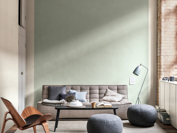
Inspired by the precious dawn horizon, Tranquil Dawn™ is a delicate shade that contains hints of green, grey and blue, giving it a varying effect depending on the colours it’s paired with. Yet, its calmness and clarity remains constant no matter where it’s used, ensuring it always translates a mood of hope and positive change. “Green as a colour in decorating is becoming as popular as pink in recent years and provides the perfect balance to warmer shades,” says Marianne.
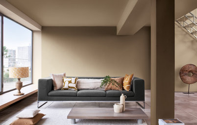
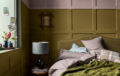
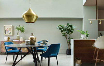
Back wall painted in Tranquil Dawn™, Dulux
Inspired by the precious dawn horizon, Tranquil Dawn™ is a delicate shade that contains hints of green, grey and blue, giving it a varying effect depending on the colours it’s paired with. Yet, its calmness and clarity remains constant no matter where it’s used, ensuring it always translates a mood of hope and positive change. “Green as a colour in decorating is becoming as popular as pink in recent years and provides the perfect balance to warmer shades,” says Marianne.
Back wall painted in Tranquil Dawn™, Dulux
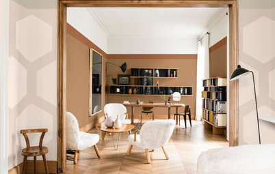
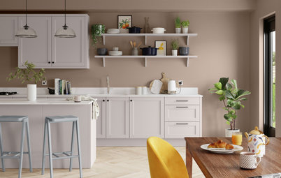
Tranquil Dawn™’s versatility allows it to work in almost any setting, alongside many different colour palettes, from graceful pastels to bold brights, moody shades and rich, earthy hues. “This calm and restful hue is brilliant at supporting all the other colours that clamour for attention in a room – it’s one of the most balancing colours you will ever find,” says Marianne.
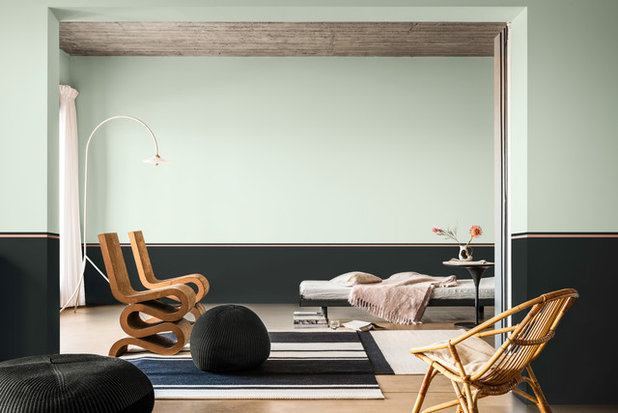
Walls painted in Basically Black (lower wall); Copper Blush™ (stripe), and Tranquil Dawn™ (upper wall), all Dulux
Walls painted in Basically Black (lower wall); Copper Blush™ (stripe), and Tranquil Dawn™ (upper wall), all Dulux
Bonus tip: With our renewed desire to reconnect with the things that truly matter, such as our natural environment, try filling your home with mood-boosting houseplants and nature-inspired colours, and you’ll have your own sanctuary of wellbeing and calm. Biophilic design – design focused on improving human connection to nature in a built environment – is increasingly gaining traction in our homes as we strive to find calm in nature and declutter our minds from the stresses of daily life. Colour and greenery are a great place to start – it’s a new dawn, it’s a new day.
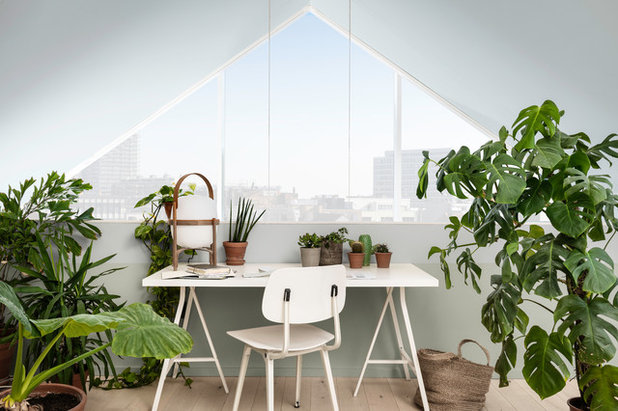
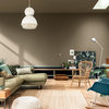
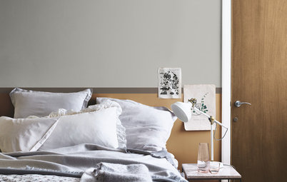
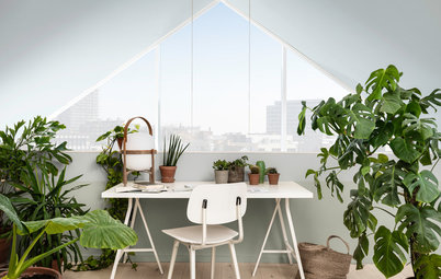
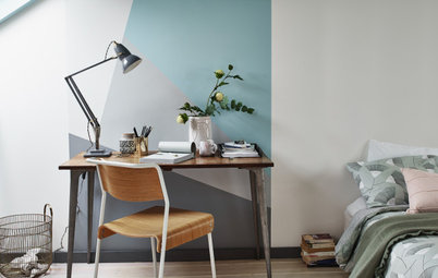
Walls painted in Misty Mirror™ (top); Borrowed Blue (under window), and Tranquil Dawn™ (bottom), all Dulux
Walls painted in Misty Mirror™ (top); Borrowed Blue (under window), and Tranquil Dawn™ (bottom), all Dulux
Behind the Trend – a Hopeful New Decade…
Ever wondered how the colour of the year is created? Well, it all starts with a dream team of independent designers, architects and colour creatives coming together to share their observations on present consumer trends, cultural influences and lifestyle patterns, in order to gauge the mood of the moment and what we’ll want from our homes in the new year.
As 2020 is a new decade and a new dawn, the experts have identified a push-back against the busy digitalised world in which we find ourselves, with a new desire to create more meaningful connections with people and nature, so we don’t lose sight of what it means to be human.
As a response, Dulux’s Colour of the Year, Tranquil Dawn™, sets out to draw nature into the home and encourage calm, relaxed spaces in which we can enjoy entertaining friends and family, get a restful night’s sleep and make a connection with the natural world. “The colour represents peace and quiet in a world that often demands more of us that we can give,” says Marianne. “I have the busiest and happiest life in colour, but when it all gets too much, I seek out spaces that offer sanctuary in shades that nurture rather than bang a drum.”
Back wall painted in Tranquil Dawn™, Dulux
How to Use It…
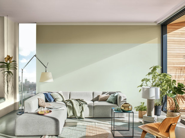
Contrast with brights. A trend that is emerging for 2020 is the joy of finding new experiences in the real world, not just through social media. As a result, people will stop taking themselves seriously and welcome a new vibrancy into their lives and their homes, with energetic colours that express individualism and creativity.
Play with a brave-new-world palette that includes bright shades like sulphur-yellow and coral, inspired by the colours of vibrant summer days. Then mix in softer tones, like Tranquil Dawn™, to balance the intensity. The result will be a stimulating environment that delights its inhabitants, and makes a perfect backdrop for geometric patterns – such as on-trend grid lines – and a mix of modern textures.
Bonus paint trick: Select a shapely piece of furniture and paint it the same shade as your brightest wall colour for cohesion – and for fun!
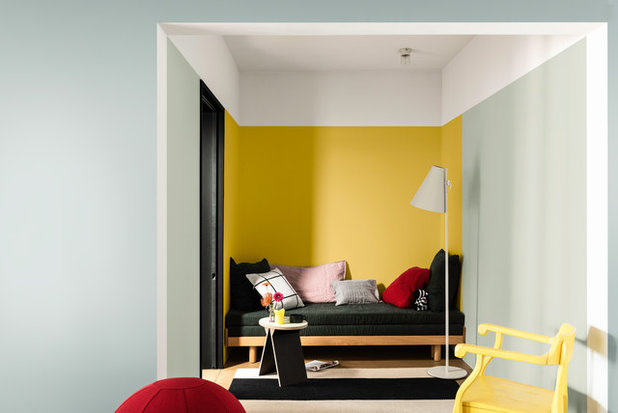
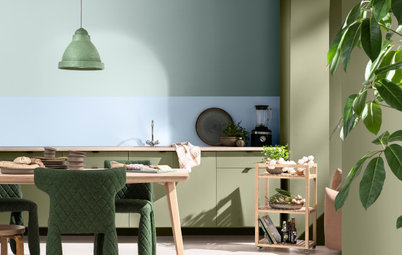
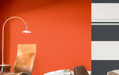
Walls painted in Citrus Zing (main back wall); Tranquil Dawn™ (side right wall); White Cotton™(ceiling), and Basically Black (door), all Dulux
Contrast with brights. A trend that is emerging for 2020 is the joy of finding new experiences in the real world, not just through social media. As a result, people will stop taking themselves seriously and welcome a new vibrancy into their lives and their homes, with energetic colours that express individualism and creativity.
Play with a brave-new-world palette that includes bright shades like sulphur-yellow and coral, inspired by the colours of vibrant summer days. Then mix in softer tones, like Tranquil Dawn™, to balance the intensity. The result will be a stimulating environment that delights its inhabitants, and makes a perfect backdrop for geometric patterns – such as on-trend grid lines – and a mix of modern textures.
Bonus paint trick: Select a shapely piece of furniture and paint it the same shade as your brightest wall colour for cohesion – and for fun!
Walls painted in Citrus Zing (main back wall); Tranquil Dawn™ (side right wall); White Cotton™(ceiling), and Basically Black (door), all Dulux
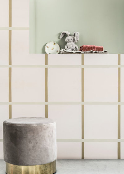
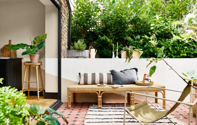
Blend with sugary tones. As caring more for ourselves, others and the environment becomes more prevalent in 2020, so does our need for soothing spaces that breathe life into our domestic routines, reminding us of how precious life is.
Welcoming nature into our home is key to retaining this ‘human factor’, so look to this pared-back mix of gentle, sugary neutrals, and you’ll capture the serenity and optimism of a hazy spring morning. “Use Tranquil Dawn™in rooms where you want, and need, a soothing, calm atmosphere, which could be anywhere from a busy open-plan family kitchen to a grown-up bedroom,” says Marianne.
Bonus paint trick: Using simple lines and relaxed styling, highlight a niche to create interest and depth to a tranquil room. Then add in tactile textures like suede and velvet to ramp up the warmth in the cool, contemporary scheme.
Walls painted in Tranquil Dawn™(back wall); Chalk Dust (squares); and Dune Grass and Tranquil Dawn™ (stripes), all Dulux
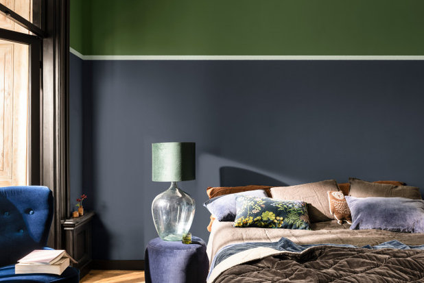
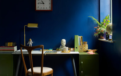
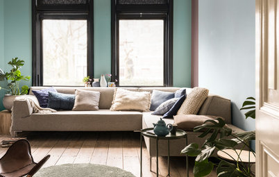
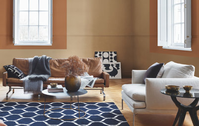
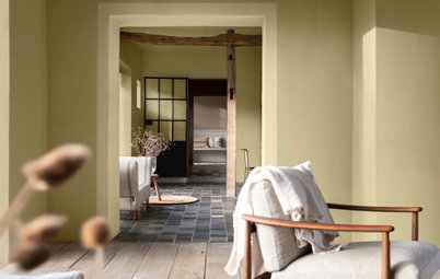
Walls painted in Sapphire Splendour (lower wall); Tranquil Dawn™ (thin stripe); and Forest Shade (upper wall), all Dulux
Soften a moodier palette. If sombre, moody and atmospheric tones are still your thing, then you’ll be pleased to know that Tranquil Dawn™ also works wonders with these rich and saturated colours, helping to uplift and refresh them.
This eclectic palette is the perfect backdrop for creative homes that enjoy a mix of old and new curiosities and layers of tactile textures, such as sumptuous velvets, aged leather and hand-knitted throws. “Layering is the key to make any decorating interesting and greens love layers,” says Marianne. “You can have lots of fun with different tones of green on different elements of the room, including furniture, without it ever looking overpowering.”
Bonus paint trick: Increase the sense of space and height in a room by clever colour blocking. Pick two complementary tones for the walls, with the lighter one for the upper section, and use a paler shade, such as Tranquil Dawn™, to separate the two with a picture rail-style stripe.
More: Find more inspiration on how to use Dulux’s Colour of the Year 2020 here.
Your turn: What do you think of the Colour of the Year for 2020?
This story was written by the Houzz Sponsored Content team.
Dulux is the UK’s leading paint brand, with a wealth of expert knowledge, products and services designed to help... Read More


Dulux is the UK’s leading paint brand, with a wealth of expert knowledge, products and services designed to help... Read More
More Stories from This Brand
16 Genius Updates for Busy Family Homes
By Dulux
Stick to these top decorating tips and your home will have that newly-painted look for longer
Full Story
Why Should You Paint Your Woodwork?
By Dulux
Introducing the coolest and easiest way of updating unsung design details such as skirtings, mouldings and door frames
Full Story
Back to Life: Discover Dulux’s Colour of the Year 2021
By Dulux
Brave Ground is a deep-toned neutral that's ideal for adding a calm, luxurious feel on its own or with other hues
Full Story
5 Inspiring & Oh-So-Soothing Bedroom Colour Combos
By Dulux
Breathe new energy into your sleep space with a transformative colour scheme
Full Story
4 Decorating Challenges And How to Solve Them
By Dulux
Updating your space can be easier than you think, as long as you can overcome these common decorating barriers.
Full Story
Refresh and Revive With Dulux’s Colour of the Year 2022
By Dulux
Find out how Dulux's uplifting colour of the year, Bright Skies™ can breathe new life into your home
Full Story
How to Choose the Perfect Paint Colour for a Cosy Bedroom
By Dulux
Discover the colours and combinations that will generate calm and weave a cosy spell in your sleep space
Full Story
Colour of the Year 2019: Get the Buzz on Spiced Honey
By Dulux
Dulux's Colour of the Year 2019 is a warm amber tone that promises to energise your home. Find out more...
Full Story
5 Paint-Tastic Ways to Transform a Room
By Dulux
Whether it's a new paint colour, a fun effect, or painting a quirky spot, a world of transformative tricks await..
Full Story
8 Ways Paint Can Help You Love Your Home More Right Now
By Dulux
With more time spent indoors, these simple DIY refreshes will help give you and your home an uplifting boost
Full Story
5 Expert Tips for Testing Paint Colours
By Dulux
Discover why sampling paints has never been easier
Full Story
How to Carve Out Spaces to Work and Rest in a Busy Home
By Dulux
Curb the work-from-home chaos with these nifty home upgrades that use paint to create defined zones
Full Story
How to Create a Timeless Look You Won’t Want to Change
By Dulux
Want to create spaces that never date? The key is to pick classic colours you'll love forever in a modern durable finish
Full Story
What's Your Colour Personality?
By Dulux
Are you team neutral or should you decorate with brights? Take the quiz to discover your decorating personality
Full Story
Trend Forecast: Key Colours for 2019
By Dulux
Get the lowdown on the latest colours you should be introducing into your home this year
Full Story
How To Choose the Perfect Neutral
By Dulux
Finding it tricky to pick the right neutral shade? Read on for some expert colour scheming advice
Full Story
How to Bring the Outside In
By Dulux
Nurture your wellbeing by bringing nature into your home with these clever decorating ideas
Full Story
Bring in Nature With Dulux’s Colour of the Year 2023
By Dulux
Discover how Dulux’s glowing natural colour, Wild Wonder™, can fill your home with positivity
Full Story
Everything You Need to Know About Painting With Grey
By Dulux
The greys of the moment are warm, earthy and oh-so-simple to use
Full Story

We love this colour, it's definitely a very calm tone and works nicely with natural woods, not to mention the Carl Hansen Shell chair.
I would never choose a colour because it was trendy. Assuming it appeals, it needs to work in all lights (natural and artificial) and seasons and with the accessories we already have. I could see it looking very chilly in some settings, while in others it could calm things down.
I love the colour. It's very much like a colour I've been using for approximately 20 years - "Apple Basket" also by Dulux. (Apple Basket is discontinued but I have the reference numbers to have it made up.