Sponsored Content

Why Should You Paint Your Woodwork?
Introducing the coolest and easiest way of updating unsung design details such as skirtings, mouldings and door frames
Sponsored Content
Ever noticed how interesting your skirting boards can be? Or how detailed the architectural mouldings around your door frames are? No? Well, we’re here to sing the praises of these quiet bystanders – the interior ‘trim’ – that has played the supporting role in our design schemes for years.
There are many reasons why painting your woodwork in a stand-out colour is the answer to your decorating woes. Maybe you’ve been struggling to find the right wall colour, when actually it’s a bold door or staircase that could make all the difference? Or perhaps a lack of light is preventing you from experimenting with a dark wall colour, but opting for dark skirting boards and cornices would be the perfect compromise. “Adding colour to the woodwork and leaving the walls neutral can give you just enough colour to make a statement without overwhelming the space,” says Dulux’s creative director, Marianne Shillingford. “Coloured woodwork can also act as a connecting thread that binds the look and feel of different rooms in a home together, as well as masking dirt and dust much better than plain white woodwork does.”
You see, even the simplest technique of painting your skirting boards and doors can completely transform a room, so use these inspiring ideas to rethink your decorating plans.
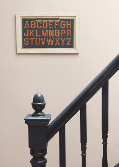
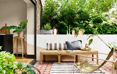
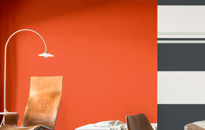
To Make a Statement…
Dark tones make a big impact when used alongside neutral walls, so have a go at painting your woodwork, such as the staircase, in a rich, stand-out colour and you’ll instantly make a chic, design statement.
“I love the saying ‘colour takes the credit but tone does all the work’ – it’s the mantra for effortlessly stylish decorating,” says Marianne. “Basically, dark items and dark colours ‘advance’, which means they look closer to us and we notice them more. The biggest contrasts in tone are the ones that grab our attention most in a room, but you don’t need lots to make a great impression, so painting the woodwork in a deeper tone than the wall is the perfect way to make a design statement that is admired by all and easy to live with.”
Style tip: Heighten the impact by complementing the stand-out colour with eye-catching accessories and prints in a similarly rich tone.
Staircase bannisters painted in ‘Black’ by Dulux.
____________________________________________________
Unsure what colour to choose for your next interior project? Be inspired by the latest trends, tips and new collections, including woodwork and metal paints, here.
____________________________________________________
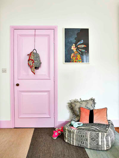
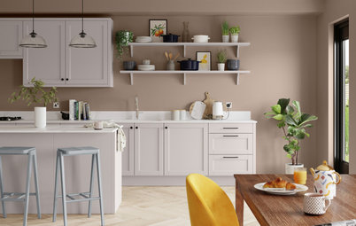
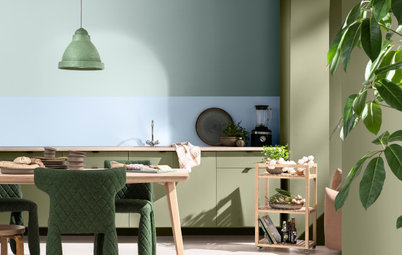
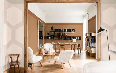
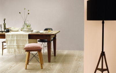
To Highlight Period Features…
Lucky enough to have stunning architectural mouldings, such as elegant internal doors and skirting boards? Then make these features the star of the show by turning them into an intriguing focal point, particularly if the rest of the room is lacking in personality. Have fun with playful shades that will add heaps of character, as well as create an interesting contrast between the old and new styles.
“We often overlook the doors, skirting boards and window frames in our homes because they have to be practical and hardwearing, but it’s actually more practical to add colour to these elements because colours are better at masking wear and tear,” says Marianne. Her top tip for speeding things up on doors? Use a brush for the mouldings and edges, and a small synthetic glossing roller for the flat surfaces and panels – two coats will give a good solid finish.
Style tip: Trying out a brave new shade on your woodwork is less commitment than painting it straight on the walls and, if you choose a mid or low-sheen finish, like Satinwood or Eggshell, any imperfections in the surface you are painting will be minimised.
Door frame and door painted in ‘Pretty Pink’ by Dulux.
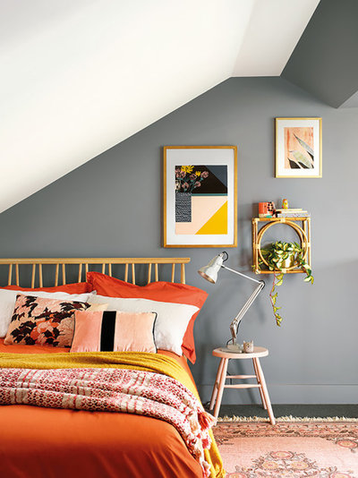
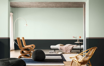
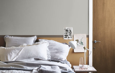
To Create an Optical Illusion…
In rooms that are spatially challenged, such as lofts with sloping ceilings, it’s possible to create a sense of extra wall space by painting the skirting the same colour as the wall. “Banishing stark white woodwork from the room allows the hard borders and edges to melt away and merge with the rest of the wall, giving the room a greater sense of space and tranquillity,” says Marianne.
This heightened sense of space can then be magnified by painting the ceiling in a paler neutral that complements the darker walls, yet still adds more depth and interest than plain white.
Style tip: Paint other elements in the room the same colour as the walls and woodwork, like picture frames and furniture, to further amplify the look and sense of space. Pale, nature-inspired tones create a cosy and comfortable ambience and work well in a space-challenged bedroom.
Back wall painted in ‘Natural Slate’; Skirting Board painted in ‘Natural Slate’, Ceiling painted in ‘White Cotton’, all Dulux.
“What’s That Paint Colour?” This Tool Will Help You Find It
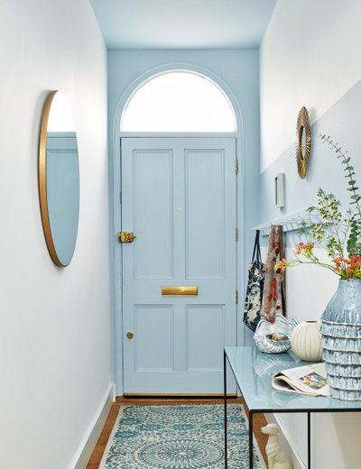
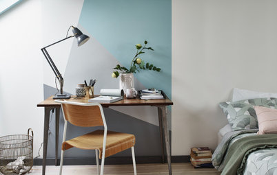
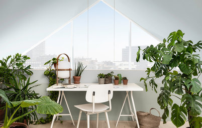
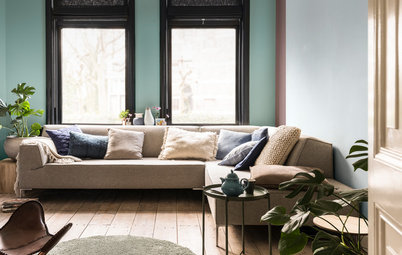
To Add a Sense of Calm…
Colours that help us to connect with nature, such as fresh greens and sky blues, will instill the most serenity in a space. Their breeziness will also help inject a light and airy feel, and can be used to gently ‘lift’ ceilings and woodwork for a sense of balance and harmony.
“Soft misty greens and blues, like Dulux’s Colour of the Year 2020, Tranquil Dawn, and delicate stone neutrals, like Dulux’s ‘Goose Down’ and ‘Polished Pebble’, remind us of quiet open spaces in which we can escape from the things that overwhelm us in our busy lives,” says Marianne.
Style tip: Painting the door at the end of a long, narrow hallway in a fresh, zingy shade, and then continuing it up onto the ceiling, will help to elongate the compact space.
Door and frame painted in ‘Mineral Mist’ by Dulux.
More: Visit our Colour Inspiration Centre for tons of creative ideas, tips and advice. Plus, find more information on Dulux’s range of interior wood and metal trim paints, here.
Your turn: Which colour have you painted your woodwork?
This story was written by the Houzz Sponsored Content team.
Dulux is the UK’s leading paint brand, with a wealth of expert knowledge, products and services designed to help... Read More


Dulux is the UK’s leading paint brand, with a wealth of expert knowledge, products and services designed to help... Read More
More Stories from This Brand
Back to Life: Discover Dulux’s Colour of the Year 2021
By Dulux
Brave Ground is a deep-toned neutral that's ideal for adding a calm, luxurious feel on its own or with other hues
Full Story
How to Create a Timeless Look You Won’t Want to Change
By Dulux
Want to create spaces that never date? The key is to pick classic colours you'll love forever in a modern durable finish
Full Story
How To Choose the Perfect Neutral
By Dulux
Finding it tricky to pick the right neutral shade? Read on for some expert colour scheming advice
Full Story
How to Choose the Perfect Paint Colour for a Cosy Bedroom
By Dulux
Discover the colours and combinations that will generate calm and weave a cosy spell in your sleep space
Full Story
Trend Forecast: Key Colours for 2019
By Dulux
Get the lowdown on the latest colours you should be introducing into your home this year
Full Story
4 Decorating Challenges And How to Solve Them
By Dulux
Updating your space can be easier than you think, as long as you can overcome these common decorating barriers.
Full Story
How to Bring the Outside In
By Dulux
Nurture your wellbeing by bringing nature into your home with these clever decorating ideas
Full Story
Refresh and Revive With Dulux’s Colour of the Year 2022
By Dulux
Find out how Dulux's uplifting colour of the year, Bright Skies™ can breathe new life into your home
Full Story
A New Dawn: Meet Dulux's Colour of the Year 2020
By Dulux
And breeaaathe – this hopeful shade is all about calm, stability and rediscovering ourselves in the decade ahead
Full Story
How to Carve Out Spaces to Work and Rest in a Busy Home
By Dulux
Curb the work-from-home chaos with these nifty home upgrades that use paint to create defined zones
Full Story
5 Inspiring & Oh-So-Soothing Bedroom Colour Combos
By Dulux
Breathe new energy into your sleep space with a transformative colour scheme
Full Story
Colour of the Year 2019: Get the Buzz on Spiced Honey
By Dulux
Dulux's Colour of the Year 2019 is a warm amber tone that promises to energise your home. Find out more...
Full Story
What's Your Colour Personality?
By Dulux
Are you team neutral or should you decorate with brights? Take the quiz to discover your decorating personality
Full Story
8 Ways Paint Can Help You Love Your Home More Right Now
By Dulux
With more time spent indoors, these simple DIY refreshes will help give you and your home an uplifting boost
Full Story
5 Paint-Tastic Ways to Transform a Room
By Dulux
Whether it's a new paint colour, a fun effect, or painting a quirky spot, a world of transformative tricks await..
Full Story
5 Expert Tips for Testing Paint Colours
By Dulux
Discover why sampling paints has never been easier
Full Story
16 Genius Updates for Busy Family Homes
By Dulux
Stick to these top decorating tips and your home will have that newly-painted look for longer
Full Story
Bring in Nature With Dulux’s Colour of the Year 2023
By Dulux
Discover how Dulux’s glowing natural colour, Wild Wonder™, can fill your home with positivity
Full Story
Everything You Need to Know About Painting With Grey
By Dulux
The greys of the moment are warm, earthy and oh-so-simple to use
Full Story

Colour is what makes interiors what they are and personal. It can also be very difficult to get it right. This is where interiors designers are so good.
Agreed! Sometimes you need an expert to give you a gentle nudge so you can make bolder choices that you may not make if you were doing it on your own!